Wednesday, 24 October 2012

chess piece drawing

  this is a scanned photo of my chess piece drawing.


this is a photograph that I took outside of my chess piece drawing.


this is a photo of my chess piece drawing on a copy stand.


 There are three different ways to photograph a drawing that I learned today and i'm going to talk about them. So the first technique that I used was that I scanned the drawing and I think it wasn't the best technique but it was ok because the scan came out a bit too bright because the scanner was too small to house the whole drawing and the cover would cut the page so we had to use a book to cover it so that might be why it is too bright. the next technique that I used was the outside photo and I personally like it more because it ended up to be not too bright and not too dark so I think that method was the best. the last technique that I used was using a photo stand to take the photo and that one to me was the worst because it shined too much on the left side and also it did the same thing on some other shinny spots.

Now to talk about the drawing in this drawing I used a pattern in this the pattern is thin line then thick line and continuously used that pattern. In the pattern in the thick line there is a value scale in it and it start's dark around the edge and continuously gets lighter until it reaches the chess piece. I was trying to create a good value scale in the background and it creates movement by leading the viewers eye from the edge of the paper to the chess piece. Also what leads the viewers eye to the chess piece is the background (the lines) because they are all progressively moving towards the chess piece. Also what is interesting in the drawing is that the circle is encasing the chess piece.




Monday, 22 October 2012


This is a photo that I took of my friend and I am supposed to explain why it's awesome. So I have added the compositional technique of leading lines because the lines on the wall lead to my friends face. Also I have added depth of field by making the begging of the bricks blurry and making the space around him blurry. Another technique that I added is the rule of thirds because my friends head is positioned at the top right intersecting point of the rule of thirds grid. What I added to this photo in photoshop was that I enhanced the colour of the brick wall because the before colour of the wall was duller so I chose to do that. If I had more time with this photo i would of added the rule of thirds because his face is to me a bit too close to the middle so I would of moved him closer to the top right corner of the image and thats the only thing that I would of added to make the image much better

Thursday, 11 October 2012

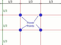
the rule of thirds


 power points of the rule of three                                              


a picture including the rule of three grid


Hey people for this blogpost I have to explain the rule of thirds to you so here it goes. The rule of thirds is a rule in which all photographers use in their photo's the rule of thirds is when a photo is divided into thirds and there are four intersecting points (example on top) on the grid and as photographers we have to try to position the focal point of the photo to be in the place of one of those power points or in one of the squares of the grid. Also if your a photographer when your taking a photo and have the rule of thirds in mind you should position the camera to have the focal point one of the four focal points.


     This photo is a great example of the rule of thirds because the two birds are both positioned at intersecting points and the intersecting points are the focal points of the picture.


my team mates                        
http://rcc12340.blogspot.ca/
http://expressingmyart.blogspot.ca/


link to my information    
http://www.silverlight.co.uk/tutorials/compose_expose/thirds.html   for the rule of thirds
http://www.explore-oil-pastels-with-robert-sloan.com/composition.html   for no kissing edges

Monday, 8 October 2012

blog post 3


Hi people this is a photo I took when my family and I were having a trip and then I took this picture. One element of design that this photo is capturing is organic shape because the faded rainbow has lots of curves in it. Also in the background there are lots of jagged edges in the rocks. Another design element that this photo is displaying is visual texture because the jagged rocks and the waterfall makes the viewers think the you can easily touch and feel the rocks but you cannot do that. The design elements of this photo impacts my experience of the photo because to me the design element of organic shape makes me feel more happy because rainbows make more people feel happy.

Monday, 24 September 2012

 
For my typographic logo i have chosen the Lamborghini logo. My description of Lamborghini's logo is that the line in the writing at the top makes the writing at the top very tall compared to a normal font and being tall shows power and strength. Also I see some contrast because the bull in the middle has some glare on it so it stands out a bit more than the rest . I think the designer of  Lamborghini's logo was trying to express that this car is new because I see a little bit of glare because the logo is glossy and maybe the logo is being shined on by a light. Also maybe he or she was trying to show that this car is powerful because bulls are powerful so people would see by the bull that this car is powerful.I think the target audience of this logo is a little bit more wealthy people because there is a little bit of shimmer in the logo it shows that this car is new.


For my abstract logo i have chosen the Atari logo. My description of ATARI'S logo is that there is a good amount of movement because on the top of the logo both sides are curved then they align with the middle line also the writing has a good amount of curves in it because in the letter r there are no corners in the middle so that shows some movement in the lettering .I think the designer of Atari's logo was trying express that it is a new never before seen logo because you don't always see that kind of logo. Also i think he or she was trying to make the logo look like some of the planes in their games. I think the target audience of this logo is everyone because it is a nice simple logo not a very complex logo.


For my pictographic logo i have chosen the twitter logo. My description of twitter's logo is that I see some shape in the logo because this is a bird and it has lots of curves and that proves that it is an organic shape.  
I think the designer of this logo was trying to express that they are allowing us to spread the word of any news that has just happened. Also I think they were trying to express that these tweets that people make will go really fast because in the logo the birds wing are up so that would show that it is flying and birds fly really fast. I think the target audience of this logo is everyone because there are millions of birds everywhere and so are there humans and birds tweet as they want and that is what twitter allows us to do.


Friday, 14 September 2012

Art critique on the painting “The Starry Night”


                                       "THE STARRY NIGHT"
                                         by Vincent Van Gogh


This painting to me is not really realistic because the sky looks like it has waves in it and in the night you don’t see that. Also the spire in the painting has wavy walls and that is impossible to make. And last the only part of the painting to me that is realistic is the town in the bottom of the painting.

In my opinion the feeling of this painting is that it is somewhat sad to me because it only uses darker shades of each color. Also I think the feeling that Vincent Van Gough was trying to express to me is that the night sky would look brighter if the stars were bigger and brighter.

I think the quality of the design is great because the way he blends the different shades of each color is amazing each stroke is a different color or shade so to me it is a very amazing painting by him. The design elements of the painting is astounding because he places each color in the best ever place with every stroke.


                        Formalism on the painting                                        
                     "the starry night"


The design elements of this painting that are amazingly painted to me is the moon in the corner I personally like how he painted the moons halo and how he drawed all of the other stars halo’s is really amazing because the way he drew them was really nice so that is my favorite design element of the drawing. Another design element of the painting that I am really amazed about are the waves in the sky even though you don’t normally see that in the sky he very nicely drew them.  


Thursday, 13 September 2012

Well hi people i found this tutorial for the rotate tool on illustrator by "MAHALO" on youtube and after I watched the video it tought me very well about the rotate tool it tought me that to rotate a logo or just about anything on illustrator you just select that object and you select the rotate tool than click on any end and you continue to hold the object and you can just rotate it .Also if you want to rotate it on a point still select the logo and select the rotate tool then click on any spot on the page then click the logo then rotate away and I learned all of that about the rotate tool and she easily explaned that so that is why that video is a great video for anyone who is new to illustraror so i guess thats is so bye.


also if you want to watch that video go on youtube and search up "how to use the rotate tool in illustrator "then look for the video by mahalo then theres the video.